Project Basics Information
Project Basics Tables
Startup Screen
| Item | Description |
|---|---|
| Create New Project | Opens the New Project window to assign settings for a new project. |
| Open Project Files | Opens a file explorer window to select a ".cnvs" file to open a project. |
| Offline Help | Opens the Canvas Offline Helpfile in a new browser tab. |
| Online Help | Opens the Canvas Online Helpfile in a new browser tab. |
| About Canvas | Opens the About Canvas window that displays the currently installed Canvas version. |
 Grid View Grid View | Changes the Recent Projects display to show projects in a grid formation. |
 List View List View | Changes the Recent Projects display to show projects in a list formation. |
New Project
| Item | Description |
|---|---|
| Project Name | Assigns a name to the user's project. The project name and the file name are not required to match, and changing the project name will not automatically update the filename. |
| Save Location | Assigns a location to save the user's project. The project file will be saved in the ".cnvs" format. The default path is C:\Users\User. This changes to the most recent location a project was created at after the first project. |
| Screen Size | Users can decide the project file type according to the dimension of each Xpanel model. The table below displays the model selections along with their widths and heights. |
| Screen Size - eXT04, eXT07, nXT07 | 800x480 |
| Screen Size - eXT2-10 | 800x600 |
| Screen Size - eXT2-07 | 1024x600 |
| Screen Size - eXT10-H, eXT12-H, eXT15 | 1024x768 |
| Screen Size - eXT2-10W | 1280x800 |
| Screen Size - Custom | User Selection |
| W | Allows the user to determine their custom project-page pixel width. A default selection will be made when selecting any screen size besides custom. |
| H | Allows the user to determine their custom project-page pixel length. A default selection will be made when selecting any screen size besides custom. |
| Landscape | Swaps the entered W (width) and H (height). If a preset Screen Size is selected, landscape will provide a horizontal orientation. |
| Portrait | Swaps the entered W (width) and H (height). If a preset Screen Size is selected, portrait will provide a vertical orientation. |
| Password - Checkbox | When the box is checked, the user can set up a password for the project. Password requirements: 1. The password is case-sensitive. 2. Alphanumeric characters, special characters, and spaces may be used. 3. The password must contain at least 8 characters. 4. The password is displayed as "****" while typing. The visibility may be toggled by clicking the icon to the right of the field. The password selected cannot be retrieved if forgotten. |
| Password - Recovery Email | Assigns a recovery email that CIMON will reference to begin a recovery process. If access to the recovery email is lost, CIMON will not continue the recovery process with any other email. |
| Password - New Password | Enter a new password for the project. |
| Password - Re-Enter Password | Re-enter the project password to confirm. |
| OK | Closes the New Project window and creates a project with the entered information. |
| Cancel | Closes the New Project window and discards the entered information. |
Project Properties
| Item | Description |
|---|---|
 Expand All Expand All | Shows all dropdown content within the Project Properties window. |
 Collapse All Collapse All | Hides all dropdown content within the Project Properties window. |
| Name | Assigns a name to the user’s project. |
| Recovery Email | Assigns a recovery email to the user's project. If a password removal is requested, the project will be sent to this email. |
| Project Password | Opens a project password window to assign or edit the user’s password for the project. |
| Starting Page | Assigns the first page shown when the project is loaded. |
| Screen Size | Displays the preset or Custom selection for the project’s screen size. |
| Screen Orientation | Displays the selection between landscape and portrait. If a preset screen size is selected, landscape will provide a horizontal orientation, and portrait will provide a vertical orientation. |
| Default Page Width | Displays the width that new pages will be created with. This matches the W (width) field in the New Project and Convert Project Size windows. |
| Default Page Height | Displays the height that new pages will be created with. This matches the H (height) field in the New Project and Convert Project Size windows. |
| Default Background Color | Assigns a default color for backgrounds of created pages. |
| Default Backgrounds | Assigns up to three default pages to be backgrounds of created pages. |
| Default Overlays | Assigns up to three default pages to be overlays of created pages. |
| Preload Pages | Assigns pages to preload at project startup to reduce load time to get to the assigned pages. |
| Beep on Touch | Controls whether an Xpanel will audibly beep when touched during runtime. |
| Enable Notifications | Controls whether notifications will be shown. |
| Indicate Clickable | Controls whether clickable objects indicate that they are clickable when hovered over. |
| Show Comm Error Overlay | Controls whether the red X over communication errors will be shown. |
| Show Permissions Warning | Controls whether permission warnings will be shown. |
| User Timeout | Controls whether a logged-in user will be logged out after the designated hours and minutes of inactivity. |
| Hours | Assigns a duration in hours to be added to minutes, which, when the length of inactivity exceeds the time, logs the current user out. |
| Minutes | Assigns a duration in minutes to be added to hours, which, when the length of inactivity exceeds the time, logs the current user out. |
| Limit 3-Button Menu Access | Rejects the use of the 3-Button Menu unless the currently logged-in user has the assigned permissions. |
| Enable Minimum Password Length | Controls whether users have a minimum password length and that the user can change the Minimum Password Length (1-16) field to a value 1-16. |
| Minimum Password Length (1-16) | Assigns a minimum length for User passwords. The default minimum length is 8. |
| Require Number And Letter | Controls whether User passwords require at least one number and letter to be included. |
| Require Special Character | Controls whether User passwords require at least one special character to be included. |
| Enable Password Reset Interval | Controls whether the user can change the Password Reset Interval (Days 1-9999) field to a value 1-9999 and check the Require Password Reset field. |
| Password Reset Interval (Days 1-9999) | Assigns a duration in days which, when surpassed, a User requires a password reset. The default minimum length is 1. |
| Require Password Reset | Controls whether a User requires a password reset after the designated amount of days. |
| Change Password On First Login | Controls whether a User is prompted to change their password on the first login. |
| Enable | Controls whether Audit Logging is enabled or disabled. |
| Database Type | Assigns a type of database to be used when audit logging. The database types are Maria DB, MySQL, PostgreSQL, and SQLite. Any database other than SQLite will store data using an external SQL database which must be set up and configured outside of Canvas. This will require a valid connection between the Xpanel and the SQL server. A database named “audit_event_database” must be on the SQL server. |
| Retention Time (Days) | Assigns a duration in days to retain audit logging information. The default length is 180. |
| Server | Assigns a server to the project’s SMTP properties. |
| Server Port Number | Assigns a server port number to the project’s SMTP properties. The default port number is 25. |
| Require Authentication | Controls whether the project’s Email/SMTP function requires a Username and Password. |
| Username | Assigns a username to attempt with the given password to log into the assigned server. |
| Password | Assigns a password to attempt with the given username to log into the assigned server. |
| Encryption | Assigns an encryption type for SMTP. The Encryption types are SSL, TLS, and None. |
| Use Device Hostname | Controls whether emails will be sent with the assigned name or the name of the current device. |
| Sender Name | Assigns a name to be displayed when sending emails. The assigned name will only display when Use Device Hostname is unchecked. |
| Sender Email Address | Assigns an email address to send emails with. |
| Send Test Email | Opens a test email window that uses the assigned email configuration to send a message to a specified email and included CC’s. The message will be automatically populated with a default Canvas Test Email. |
| Base Page Current Number | The number of the current page the project is on. |
| Base Page Request Number | The index of the page to be opened. |
| Auto-Reset Request Number | Toggle to set the request value to -1 after used. |
| Popup Page Control Value | Enables the use of the Popup Page Request Number. |
| Popup Page Request Number | The index of the popup page to be opened. |
| Popup Page X Position | Assigns the X position to the Popup page when opened. |
| Popup Page Y Position | Assigns the Y position to the Popup page when opened. |
Convert Project Size
| Item | Description |
|---|---|
| Screen Size | Users can decide the project file type according to the dimension of each Xpanel model. The table below displays the model selections along with their widths and heights. |
| Screen Size - eXT04, eXT07, nXT07 | 800x480 |
| Screen Size - eXT2-10 | 800x600 |
| Screen Size - eXT2-07 | 1024x600 |
| Screen Size - eXT10-H, eXT12-H, eXT15 | 1024x768 |
| Screen Size - eXT2-10W | 1280x800 |
| Screen Size - Custom | User Selection |
| W | Allows the user to determine their custom project-page pixel width. A default selection will be made when selecting any screen size besides custom. |
| H | Allows the user to determine their custom project-page pixel length. A default selection will be made when selecting any screen size besides custom. |
| Landscape | Swaps the entered W (width) and H (height). If a preset Screen Size is selected, landscape will provide a horizontal orientation. |
| Portrait | Swaps the entered W (width) and H (height). If a preset Screen Size is selected, portrait will provide a vertical orientation. |
| Resize objects | Controls whether objects will be resized to the newly assigned screen size. |
| Apply to pop-up pages | Controls whether the newly assigned screen size will apply to pop-up pages. |
| Maintain object aspect ratio | Controls whether objects will be anchored to a direction after screen size is changed. |
| Anchor | Assigns a direction for objects to anchor to when the Maintain object aspect ratio field is checked. The Anchor directions are Top Left, Center, and Bottom Right. |
| Backup | Controls whether a backup project will be made with the assigned name and path after screen size is changed. |
| Backup Name | Assigns a name to the user’s backup project. The project name and the file name are not required to match, and changing the project name will not automatically update the filename. |
| Backup Path | Assigns a location to save the user’s backup project. The project file will be saved in the “.cnvs” format. The default path is C:\Users\User. This changes to the most recent location a project was created at after the first project. |
Designer Settings
| Item | Description |
|---|---|
| Expand All | Shows all dropdown content within the Designer Settings window. |
| Collapse All | Hides all dropdown content within the Designer Settings window. |
| Default Save Location | Assigns a location to save the user’s project or backup project when a save location is asked for. The Default Save Location field will change to the most recent location a project was saved at. |
| Language | Assigns a language to be shown on all fields and names in Canvas. The supported languages are English, Korean, Spanish, Thai, and Portuguese. |
| Autosave | Controls whether the user’s project will automatically save every 5 minutes. If a blocking window is open, which forces the user to press OK or Cancel, the project will wait to save until no blocking windows are open. |
| Auto-Resize Font | Controls whether text objects will automatically re-size font when resizing the object. |
| Theme | Assigns a display theme to Canvas. The supported themes are Light and Dark. |
| Allow system.execute | Controls whether system.execute commands can be used within the Simulator. |
| Show system.execute warning | Controls whether warnings will be shown when using system.execute commands within the Simulator. |
Basic Properties
Each feature will have personalized tables. The following table combines the Basic Properties pane of all objects:
| Item | Description |
|---|---|
| Expand All | Shows all dropdown content within the Basic Properties pane. |
| Collapse All | Hides all dropdown content within the Basic Properties pane. |
| Name | Assigns a name to the user’s object. |
| Text | Assigns a string to the object’s initial text value. A tag may be bound to this property to control the value in runtime. |
| Transparent Color | Sets a color to be treated as transparent. |
| Placeholder | Assigns text to be shown when there is no typed string and no tag with a string value is bound. A tag may be bound to this property to control the value in runtime. |
| Input Hint | Controls which on-screen keyboard variant is displayed when clicking on a Text Field object while using a physical Xpanel. |
| Echo Mode | Controls if typed characters are displayed and in an encrypted format or not. |
| Enabled | Controls whether or not the Text or Numeric Field or a button is interactable. A tag may be bound to this property to control the value in runtime. |
| Use On-Screen Keyboard | Controls whether or not the On-Screen Keyboard is shown when clicking on a Text or Numeric Field while using a physical Xpanel. |
| Focus Index | Controls the order that pressing tab gives focus. If any Focus Index fields have equivalent values, the tab will focus from least recently to most recently created. |
| Preview | Displays the data format shown when accounting for decimal places and leading zeros. |
| Decimal Places | Sets how many decimal places there should be in the data. |
| Using Leading Zeros | Controls whether or not there will be leading zeros for data output. |
| Leading Zeros | Sets how many leading zeros to use. |
| Base | Set between a Decimal or Hexadecimal base. |
| Use Thousands Separator | Controls whether or not there will be a comma between every three digits of a number. |
| State | Controls which state will be shown based on a numeric value. A tag may be bound to this property to control the value in runtime. |
| Image | Sets an image to be displayed for the current state. |
 Font Name Font Name | Controls the font style of the object’s text. A font can be imported to use by clicking the plus button. |
| Font Size | Controls the size of the object’s text. A tag may be bound to this property to control the value in runtime. |
| Italic | Sets the object’s text to be italicized. A tag may be bound to this property to control the value in runtime. |
| Bold | Sets the object’s text to be bolded. A tag may be bound to this property to control the value in runtime. |
| Underline | Sets the object’s text to be underlined. A tag may be bound to this property to control the value in runtime. |
| Text Color | Sets the color of the object’s text. A tag may be bound to this property to control the value in runtime. |
| Horizontal Alignment | Sets the alignment area of text on the object’s x-axis. |
| Vertical Alignment | Sets the alignment area of text on the object’s y-axis. |
| Tag | Assigns a tag to an object’s parameter. Some objects require a tag to be bound to function. |
| On Press Value | Assigns this value to a Momentary Button’s tag value when pressed. |
| On Release Value | Assigns this value to a Momentary Button’s tag value when unpressed. |
| Min Value | Sets the minimum value displayed by the object. A tag may be bound to this property to control the value in runtime. |
| Max Value | Sets the maximum value displayed by the object. A tag may be bound to this property to control the value in runtime. |
| Value | Sets a value to display in a Numeric Text Object, Fillable Rectangle, or Gauge. A tag may be bound to this property to control the value in runtime. |
| Major Steps | Sets the number of sections the value range is divided into. A tag may be bound to this property to control the value in runtime. |
| Minor Steps | Sets the number of sections each major step range is divided into. A tag may be bound to this property to control the value in runtime. |
| Labels Enabled | Controls whether or not the number display for major steps is visible. A tag may be bound to this property to control the value in runtime. |
| Ticks Enabled | Controls whether or not the lines for minor steps is visible. A tag may be bound to this property to control the value in runtime. |
| Date Time Format | Sets the format of time. |
| Sample Period (ms) | Configures time interval for the data display. Values between 100 and display time are accepted. |
| Min Value | Sets the minimum value of the y-axis. A tag may be bound to this property to control the value in runtime. |
| Time Direction | Sets the direction the pen lines flow. |
| Historical | Removes storage cap for Trend data. |
| Hours | Sets the Hours Time Span value. This is shown on the x-axis. |
| Minutes | Sets the Minutes Time Span value. This is shown on the x-axis. |
| Seconds | Sets the Seconds Time Span value. This is shown on the x-axis. |
| Description | Assigns a description for the current pen. |
| Pen Color | Assigns a color to the line of the current pen. |
| Pen Width | Assigns a width to the line of the current pen. |
| Pen Type | Assigns a style to the line of the current pen. |
| Data Logger Model | Sets a Data Model that a data a Data Log Table will display. |
| Format Type | Sets the Format to be Numeric or to follow the Tag Formatting in the Tag List in a Data Logger Model. |
| Include ID Column | Controls whether or not Columns will display their ID. |
| Column Width | Sets the Width of the Column in pixels. |
| Initial Tab | Controls the starting tab of an Alarm Summary object on the initialization of the project and re-opening of the page. The default is the “Active Alarms” tab. |
| Visibility | Controls whether an Alarm Summary tab is visible or not. A tag may be bound to this property to control the status in runtime. |
 Delete Delete | Removes the Column from an Alarm Summary object’s tab. |
| Content | Controls which type of data is shown in the Alarm Summary’s column. |
| Width | Assigns the default horizontal distance for an Alarm Summary’s column. This can be changed while in runtime. |
| Format | Selects the date/time Format for the “Alarm Time” column in an Alarm Summary object. |
| Precision | Selects the number of decimal places to follow a value. |
| Description Index | Assigns the index of the alarm description to display. |
| Focus Index | Sets the priority for what will be selected first. |
| Auto Focus | Automatically selects the text or numeric field on startup. |
Appearance
Each feature will have personalized tables. The following table combines the Appearance pane of all objects:
| Item | Description |
|---|---|
| Expand All | Shows all dropdown content within the Appearance pane. |
| Collapse All | Hides all dropdown content within the Appearance pane. |
| Visibility | Controls whether the object is displayed or hidden. A tag may be bound to this property to control the status in runtime. |
| Opacity | Controls the transparency of the object. A tag may be bound to this property to control the value in runtime. |
| Blinking | Controls whether the object blinks. A tag may be bound to this property to control the value in runtime. |
| Blink Interval(ms) | Controls how often the object blinks. |
| Width | Controls the thickness of the lines of an object. A tag may be bound to this property to control the value in runtime. |
| Stroke Color | Controls the color of the lines of an object. A tag may be bound to this property to control the value in runtime. |
| Stroke Type | Controls the style of the lines of an object. The available styles are None, Solid, Dashed, and Dotted. |
| Fill Type | Controls whether an object will fill with the fill color or not. The options are None and Solid. |
| Fill | Controls the fill color of an object. A tag may be bound to this property to control the value in runtime. |
| Horizontal Radius | Controls the horizontal curvature of a Rectangle’s lines. A tag may be bound to this property to control the value in runtime. |
| Vertical Radius | Controls the vertical curvature of a Rectangle’s lines. A tag may be bound to this property to control the value in runtime. |
| Start Angle | Controls the starting location in degrees of an object’s lines. A tag may be bound to this property to control the value in runtime. |
| Arc Angle | Controls the amount of degrees an object's lines travel. A tag may be bound to this property to control the value in runtime. |
| Font Name | Changes the font style of the object’s text. A font can be imported to use by clicking the plus button. |
| Font Size | Controls the size of the object’s text. A tag may be bound to this property to control the value in runtime. |
| Italic | Sets the object’s text to be italicized. A tag may be bound to this property to control the value in runtime. |
| Underline | Sets the object’s text to be bolded. A tag may be bound to this property to control the value in runtime. |
| Bold | Sets the object’s text to be bolded. A tag may be bound to this property to control the value in runtime. |
| Font Color | Sets the color of the object’s text. A tag may be bound to this property to control the value in runtime. |
| Horizontal Alignment | Sets the alignment area of text on the object’s x-axis. |
| Vertical Alignment | Sets the alignment area of text on the object’s y-axis. |
| Fill Direction | Controls the direction that a Fillable Rectangle fills. The available directions are Top to Bottom, Bottom to Top, Left to Right, and Right to Left. |
| Background Color | Controls the color of the cells for an Alarm Summary object or the color around the cells for a Trend object. A tag may be bound to this property to control the value in runtime. |
| Chart Background Color | Controls the color of the cells within a Trend object. A tag may be bound to this property to control the value in runtime. |
| Grid Color | Controls the color of the cells within a Trend object. A tag may be bound to this property to control the value in runtime. |
| Show Controls | Controls whether the Controls of the grid in a Trend object are displayed or hidden. A tag may be bound to this property to control the value in runtime. |
| Show Time Span Legend | Controls whether the date and time range of the grid in a Trend object is displayed or hidden. A tag may be bound to this property to control the value in runtime. |
| Show Tag Values | Controls whether pen description and most recent tag values in a Trend object are displayed or hidden. A tag may be bound to this property to control the value in runtime. |
| Show Grid | Controls whether a Trend object’s borders between cells are displayed or hidden. A tag may be bound to this property to control the value in runtime. |
| Show X-Axis Labels | Controls whether the labels of the x-axis in a Trend object are displayed or hidden. A tag may be bound to this property to control the value in runtime. |
| Show Y-Axis Labels | Controls whether the labels of the y-axis in a Trend object are displayed or hidden. A tag may be bound to this property to control the value in runtime. |
| Show Value Span Slider | Controls whether the slider on a Trend object’s right side is displayed or hidden. A tag may be bound to this property to control the value in runtime. |
| Text Color | Controls the color of the text in the cells of a Data Log Table. A tag may be bound to this property to control the value in runtime. |
| Active Color | Controls the color of active alarms in an Alarm Summary object. A tag may be bound to this property to control the value in runtime. |
| Active Acknowledged Color | Controls the color of active acknowledged alarms in an Alarm Summary object. A tag may be bound to this property to control the value in runtime. |
| Cleared Color | Controls the color in which cleared alarms in an Alarm Summary object are displayed. A tag may be bound to this property to control the value in runtime. |
| Cleared Acknowledged Color | Controls the color in which cleared acknowledged alarms in an Alarm Summary object are displayed. A tag may be bound to this property to control the value in runtime. |
| Display Header | Controls whether the header of each column in an Alarm Summary object is shown. A tag may be bound to this property to control the value in runtime. |
| Display Grid Lines | Controls whether the borders between cells are shown or not. A tag may be bound to this property to control the value in runtime. |
| Display User Controls | Controls whether control buttons in an Alarm Summary object are shown or not. A tag may be bound to this property to control the value in runtime. |
| Show Active Acknowledged | Controls the initial selection of whether Active-Acknowledged alarms in an Alarm Summary object are displayed or hidden. A tag may be bound to this property to control the value in runtime. |
| Show Active Unacknowledged | Controls the initial selection of whether Active-Unacknowledged alarms in an Alarm Summary object are displayed or hidden. A tag may be bound to this property to control the value in runtime. |
| Show Cleared Acknowledged | Controls the initial selection of whether Cleared-Acknowledged alarms in an Alarm Summary object are displayed or hidden. A tag may be bound to this property to control the value in runtime. |
| Show Cleared Unacknowledged | Controls the initial selection of whether Cleared-Unacknowledged alarms in an Alarm Summary object are displayed or hidden. A tag may be bound to this property to control the value in runtime. |
Transform
All objects' Transform panes are identical.
| Item | Description |
|---|---|
| X | Controls the horizontal placement of an object. A tag may be bound to this property to control the value in runtime. |
| Y | Controls the vertical placement of an object. A tag may be bound to this property to control the value in runtime. |
| Z Index | Controls the layering of objects. Objects with a lower z-index will lay on top of objects with a higher z-index. The lowest z-index is 0. |
| Width | Controls the horizontal distance of an object. A tag may be bound to this property to control the value in runtime. |
| Height | Controls the vertical distance of an object. A tag may be bound to this property to control the value in runtime. |
| Rotation | Controls the rotational orientation of an object. A tag may be bound to this property to control the value in runtime. |
| Use Percentage | Controls whether Rotation Centers X and Y are used as percentages or values. |
| Rotation Center X | Sets the x-position of where the object will rotate from. |
| Rotation Center Y | Sets the y-position of where the object will rotate from. |
Actions
Objects may have action functionality for on press, on release, on double-click, or on enter. The following table combines the Actions pane of all objects:
| Item | Description |
|---|---|
| Expand All | Shows all dropdown content within the Actions pane. |
| Collapse All | Hides all dropdown content within the Actions pane. |
| Touch Enabled | Controls whether or not the object has touch functionality. A tag may be bound to this property to control the value in runtime. |
| Hold (ms) | Sets a length of time a user must be pressing down before the On Press action executes. |
| Action | Assigns a command or script to execute On Press, On Release, or On Double-Click. |
| Delay (ms) | Sets a length of time that will pass before the On Release action executes. |
| Interval (ms) | Sets a length of time that starts when a user clicks and must click again before it elapses before the On Double Click action executes. |
| Permissions | Assigns permissions that a logged-in user is required to have to interact with the object. |
Status Bar
| Item | Description |
|---|---|
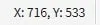 Cursor Coordinates Cursor Coordinates | Relays the information of the user’s cursor pixel location within the graphic page. |
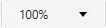 Magnification Magnification | Relays the information of the user’s currently selected magnification level. |
 Device Connection Status Device Connection Status | Relays whether the user is connected or disconnected from their selected device(s). Green is all connected, yellow is some disconnected, and red is no connection. |