Fillable Rectangle Introduction
Fillable Rectangle Feature Description
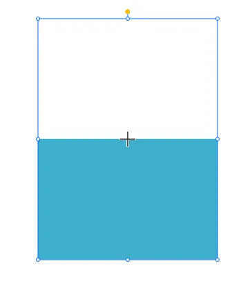
The Fillable Rectangle is a GUI object that can be used to display a rectangle with a fill color that can be changed based on a tag value. This object is useful for displaying data in a graphical format, such as a bar graph or a progress bar. The fillable rectangle can be customized to display different colors based on the value of a tag, allowing users to quickly visualize data trends.
Fillable Rectangle Designer Functionalities
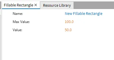
The fillable rectangle can have a Max Value and Default value set. This can be changed within the basic properties of the Fillable Rectangle. To create a Fillable Rectangle object, click Insert > Fillable Rectangle, or the Insert Fillable Rectangle icon in the toolbar, and click and drag on the page to bring up the Fillable Rectangle object.
Properties
Provides ways to customize the user’s Fillable Rectangle.
When there is no tag bound to the Fillable Rectangle, it will only function as a rectangle. To allow the Fillable Rectangle functionality, bind a tag to the Fillable Rectangle object by either smart binding the tag to the Fillable Rectangle, or by binding the tag to the Value parameter within Basic Properties.
Basic Properties
The Basic Properties window allows changing the displayed content and formatting within the object. Users can set the Max Value and Default Value of the Fillable Rectangle within this window. The object’s name will show up in place of Basic Properties, as pictured below:
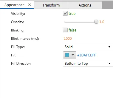
Appearance
The Appearance pane enables the use of selections to alter visible characteristics.
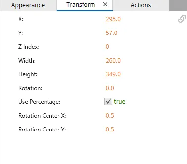
Transform
The Transform tab provides adjustable properties that reshape or move the Fillable Rectangle object.
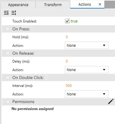
Actions
If the Fillable Rectangle is pressed, released, or double-clicked, the action button runs a script or command. This is controlled under the On Press, On Release, or On Double click section of the Actions tab.