Drawing Object Introduction
Feature Description
Canvas offers a variety of drawing objects, including lines, rectangles, ellipses, pies, arcs, chords, polygons, and polylines. These objects do not have inherent states but can be made interactive by assigning tags to their properties. They are fully resizable and can rotate 360 degrees, providing flexibility in design. By adjusting their properties, users can easily create visually engaging and functional designs.
Line Designer Functionalities
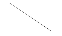
The Line object draws vertical, horizontal, or diagonal lines within the canvas. It provides a simple yet versatile tool for adding straight lines to the design. To create a Line object, click Insert > Line, or the Insert Line icon in the toolbar, and click and drag on the page to bring up the Line object.
Properties
Provides ways to customize the user’s Line object.
When no tag or action is bound to the Line object, it will only function as a shape. To allow the Line's functionality, bind a tag or a script to its properties. Then, create an action to toggle the tag when pressing the Line object.
To ensure the property windows are enabled, click View > Properties > Basic Properties, Appearance, Transform, or Actions and check the boxes.
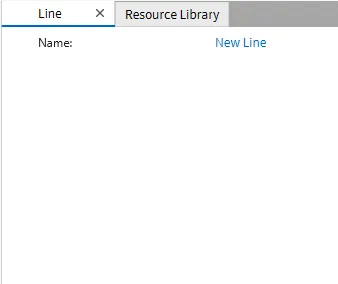
Basic Properties
The Basic Properties window allows changing the name of the Line object. The object’s name will show up in place of Basic Properties, as pictured below:
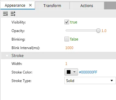
Appearance
The Appearance pane enables the use of selections to alter visible characteristics.
Transform
The Transform tab provides adjustable properties that reshape or move the Line object.
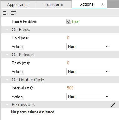
Actions
If the Line object is pressed, released, or double-clicked, the action button runs a script or command attached to it. This is controlled under the On Press, On Release, or On Double click section of the Actions tab.
Rectangle Designer Functionalities
The Rectangle object is used to draw either a rectangle or a square. Users can adjust the dimensions by dragging the corners or sides to resize the object. Additionally, it can be customized with various properties, such as color, border thickness, and rotation, for enhanced design flexibility. To create a Rectangle object, click Insert > Rectangle, or the Insert Rectangle icon in the toolbar, and click and drag on the page to bring up the Rectangle object.
Properties
Provides ways to customize the user’s Rectangle object.
When no tag or action is bound to the Rectangle object, it will only function as a shape or an object. To allow the Rectangle's functionality, bind a tag or a script to its properties. Then, create an action to toggle the tag when pressing the Rectangle object.
Basic Properties
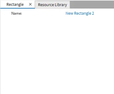
The Basic Properties window allows changing the name of the Rectangle object. The object’s name will show up in place of Basic Properties, as pictured below:
Appearance
The Appearance settings panel adjusts visibility, opacity, and fill options. It also provides controls for customizing the stroke's width, color, and style, including options like solid fill and stroke types.
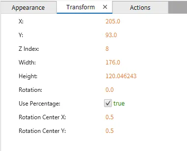
Transform
The Transform tab provides adjustable properties that reshape or move the Rectangle object.
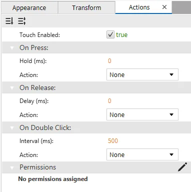
Actions
If the Rectangle object is pressed, released, or double-clicked, the action button runs a script or command that is attached to it. This is controlled under the On Press, On Release, or On Double click section of the Actions tab.
Ellipse Designer Functionalities
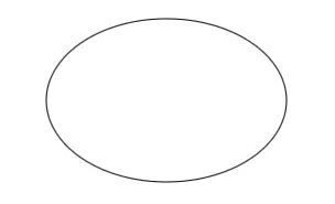
An Ellipse tool can be used to draw a circle and an ellipse. Users can adjust the shape's dimensions by clicking and dragging on the canvas to be perfectly round or elongated. After drawing, the shape can be modified with different design features like fill colors, border styles, and size adjustments to fit the needs. To create an Ellipse object, click Insert > Ellipse, or the Insert Ellipse icon in the toolbar, and click and drag on the page to bring up an Ellipse object.
Properties
Provides ways to customize the user’s Ellipse object.
When no tag or action is bound to the Ellipse object, it will only function as a shape or an object. To allow Ellipse functionality, bind a tag or a script to its properties. Then, create an action to toggle the tag when pressing the Ellipse object.
Basic Properties
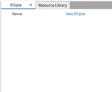
The Basic Properties window allows changing the name of the Ellipse object. The object’s name will show up in place of Basic Properties, as pictured below:
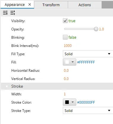
Appearance
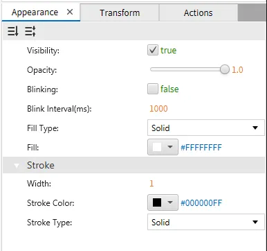
The Appearance settings panel adjusts visibility, opacity, and fill options. It also provides controls for customizing the stroke's width, color, and style, including options like solid fill and stroke types.
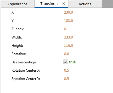
Transform
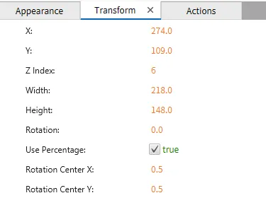
The Transform tab provides adjustable properties that reshape or move the Ellipse object.
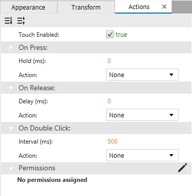
Actions
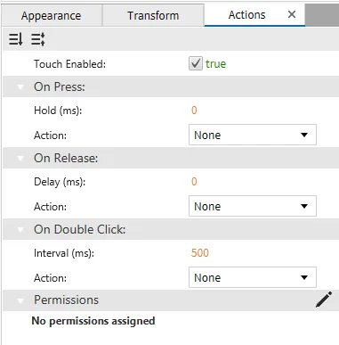
If the Ellipse object is pressed, released, or double-clicked, the action button runs a script or command attached to it. This is controlled under the On Press, On Release, or On Double click section of the Actions tab.
Pie Designer Functionalities
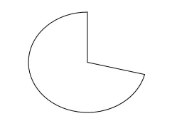
The pie object is used to create sectors or portions of a circle. Users can define specific circle sections by adjusting the start and end angles. Additionally, the pie object can be resized and customized with different colors and borders to enhance its visual representation. To create a Pie object, click Insert > Pie, or the Insert Pie icon in the toolbar, then click and drag on the page to bring up the Pie object.
Properties
Provides ways to customize the user’s Pie object.
When no tag or action is bound to the Pie object, it will only function as a shape or an object. To allow the Pie functionality, bind a tag or a script to its properties. Then, create an action to toggle the tag when pressing the Pie object.
Basic Properties
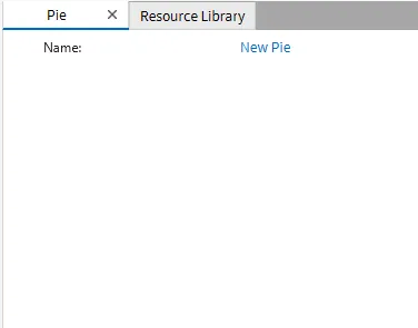
The Basic Properties window allows changing the name of the Pie object. The object’s name will show up in place of Basic Properties, as pictured below:
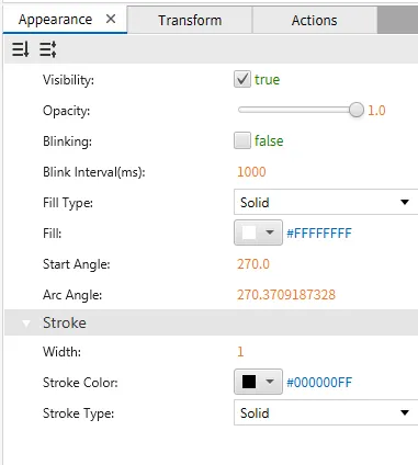
Appearance
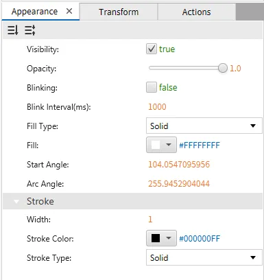
The Appearance settings allow customization of visibility, opacity, and blinking options. It also provides controls for setting the fill type, color, start angle, arc angle, and stroke properties, such as width, color, and stroke style.
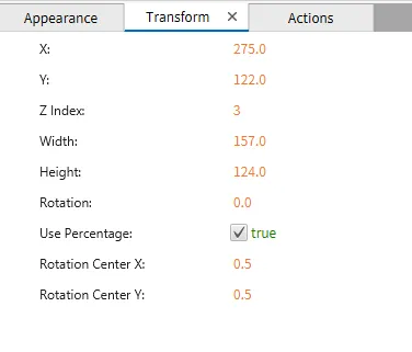
Transform
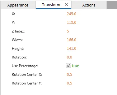
The Transform tab provides adjustable properties that reshape or move the Pie object.
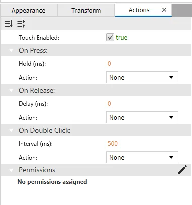
Actions
If the Pie object is pressed, released, or double-clicked, the action button runs a script or command attached to it. This is controlled under the On Press, On Release, or On Double Click section of the Actions tab.
Arc Designer Functionalities
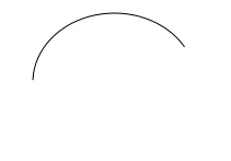
The arc tool creates curved sections of a circle. In the canvas, it can be used to visualize angles, create curved design elements, or represent circular progress indicators. It is versatile and can be adjusted for different arc lengths and orientations to fit various design or technical needs. To create an Arc object, click Insert > Arc, or the Insert Arc icon in the toolbar, and click and drag on the page to bring up an Arc object.
Properties
Provides ways to customize the user’s Arc object.
When no tag or action is bound to the Arc object, it will only function as a shape. To allow the Arc functionality, bind a tag or a script to its properties. Then, create an action to toggle the tag when pressing the Arc object.
Basic Properties
The Basic Properties window allows changing the name of the Arc object. The object’s name will show up in place of Basic Properties, as pictured below:
Appearance
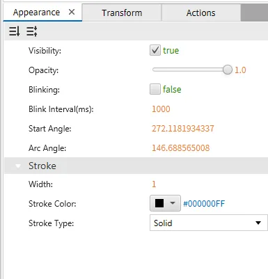
The Appearance tab allows the users to adjust visibility, opacity, and blinking options and precisely control the start and arc angles. Additionally, it offers stroke settings to modify the width, color, and style of the object's outline.
Transform
The Transform tab provides adjustable properties that reshape or move the Arc object.
Actions
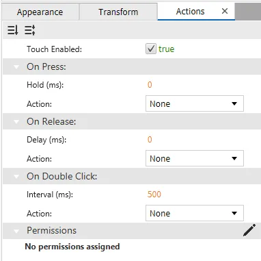
If the Arc object is pressed, released, or double-clicked, the action button runs a script or command attached to it. This is controlled under the On Press, On Release, or On Double Click section of the Actions tab.
Chord Designer Functionalities
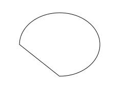
The chord tool creates straight lines connecting two points on the circumference of a circle. In the canvas, chords can be used in technical diagrams, circular charts, or custom graphical designs. To create a Chord object, click Insert > Chord, or the Insert Chord icon in the toolbar, then click and drag on the page to bring up the Chord object.
Properties
Provides ways to customize the user’s Chord object.
When no tag or is action bound to the Chord object, it will only function as a shape or an object. A tag or a script can be bound to its properties to allow the Chord functionality. Then, create an action to toggle the tag when pressing the Chord object.
Basic Properties
The Basic Properties window allows changing the name of the Chord object. The object’s name will show up in place of Basic Properties, as pictured below:
Appearance
The Appearance tab allows customization of visibility, opacity, and blinking options. It also provides controls for setting the fill type, color, start angle, arc angle, and stroke properties, such as width, color, and stroke style.
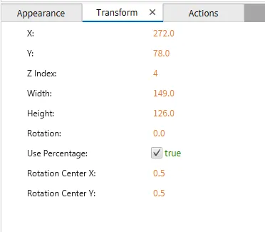
Transform
The Transform tab provides adjustable properties that reshape or move the Chord object.
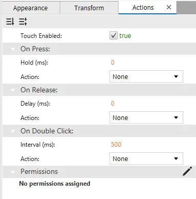
Actions
If the Chord object is pressed, released, or double-clicked, the action button runs a script or command attached to it. This is controlled under the On Press, On Release, or On Double Click section of the Actions tab.
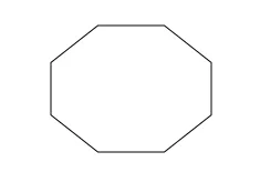
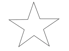
Polygon Designer Functionalities
The polygon tool allows users to customize the number of sides, ranging from 3 to 20, along with the height and width of the shape. This flexibility makes it easy to create various geometric shapes, from triangles to complex polygons. To create a Polygon object, click Insert > Polygon, or the Insert Polygon icon in the toolbar, and click and drag on the page to bring up the Polygon object.
Properties
Provides ways to customize the user’s Polygon object.
When no tag or action is bound to the Polygon object, it will only function as a shape or an object. To allow the Polygon's functionality, bind a tag or a script to its properties. Then, create an action to toggle the tag when pressing the Polygon object.
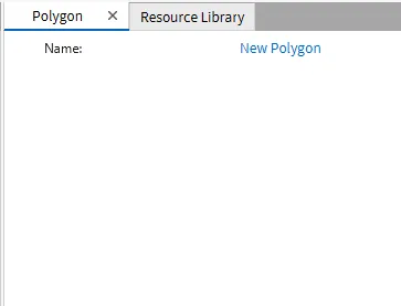
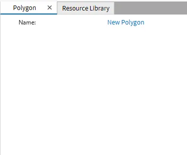
Basic Properties
The Basic Properties window allows changing the name of the Polygon object. The object’s name will show up in place of Basic Properties, as pictured below:
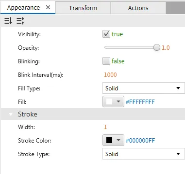
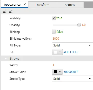
Appearance
The Appearance settings panel adjusts visibility, opacity, and fill options. It also provides controls for customizing the stroke's width, color, and style, including options like solid fill and stroke types.
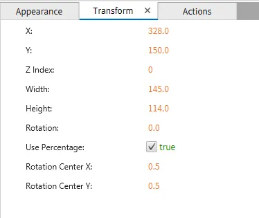
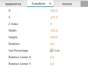
Transform
The Transform tab provides adjustable properties that reshape or move the Polygon object.
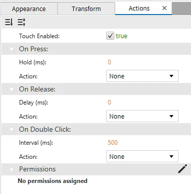
Actions
If the Polygon object is pressed, released, or double-clicked, the action button runs a script or command attached to it. This is controlled under the On Press, On Release, or On Double Click section of the Actions tab.
Polyline Designer Functionalities
The polyline tool allows users to draw multiple connected lines without limiting the number of segments. A closed shape is formed, when the final point is connected to the starting point. This tool is perfect for creating custom, complex shapes, and users can easily adjust individual line segments to refine the design. To create a Polyline object, click Insert > Polyline, or the Insert Polyline icon in the toolbar, then click and drag on the page to bring up the Polyline object.
Properties
Provides ways to customize the user’s Polyline object.
When no tag or action is bound to the Polyline object, it will only function as a shape or an object. To allow the Polyline's functionality, bind a tag or a script to it's properties. Then, create an action to toggle the tag when pressing the Polyline object.
Basic Properties
The Basic Properties window allows changing the name of the Polyline object. The object’s name will show up in place of Basic Properties, as pictured below:
Appearance
The Appearance tab adjusts visibility, opacity, and fill options. It also provides controls for customizing the stroke's width, color, and style, including options like solid fill and stroke types.
Transform
The Transform tab provides adjustable properties that reshape or move the Polyline object.
Actions
If the Polyline object is pressed, released, or double-clicked, the action button runs a script or command attached to it. This is controlled under the On Press, On Release, or On Double Click section of the Actions tab.