Button Introduction
Button Feature Description
Section titled “Button Feature Description”Canvas has three built-in button types: momentary, action, and toggle. Momentary buttons toggle the value of a tag when the button is pressed and released. Action buttons perform an action when the button is pressed, released, or double-clicked. Toggle buttons are very similar to momentary buttons, but function to retain the value changed until the button is pressed again.
Button Designer Functionalities
Section titled “Button Designer Functionalities”Click Insert > Buttons, or the Insert Button icon on the toolbar, and select the button to create. Click and drag on the page to bring up the selected button.
Momentary Button Properties
Section titled “Momentary Button Properties”The momentary button changes a tag's value when it is pressed and released. The momentary button also functions when it is pressed, released, or double-clicked, allowing for scripts or other commands to be called.
The momentary button has two states: inactive and active. Depending on the button state, the image and text, if enabled, can be customized.
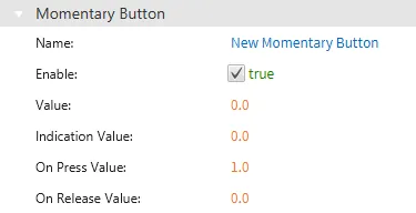
Basic Properties
Section titled “Basic Properties”The Basic Properties section allows users to change the displayed content and formatting within the object. The basic properties section will appear as "Momentary Button."
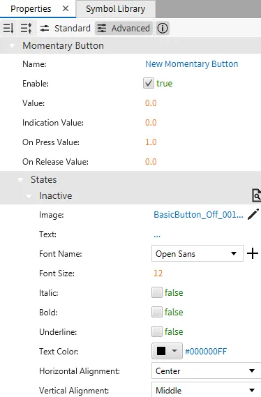
The momentary button should have a tag bound to it. When the button is pressed, the tag value is the same as the on press value entry. When the button is released, the tag value is the same as the on release value entry.
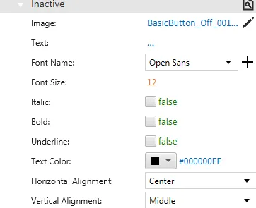
Inactive
Section titled “Inactive”The momentary button has two states: inactive and active. The inactive state can be customized under the inactive tab. When the button is released or not being pressed, the button image can be customized, and text, if enabled, can appear.
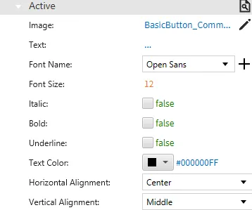
Active
Section titled “Active”The active state can be customized under the active tab. When the button is active, the below properties will render.
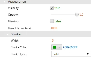
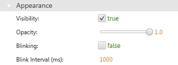
Appearance
Section titled “Appearance”The Appearance section enables the use of selections to alter visible characteristics.
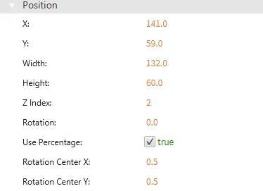
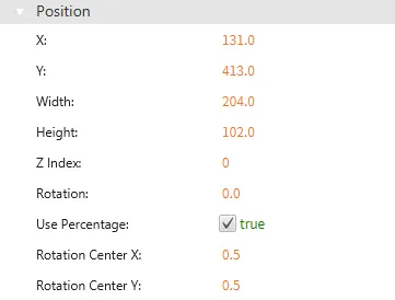
Position
Section titled “Position”The Position section provides adjustable properties that reshape or move the object.
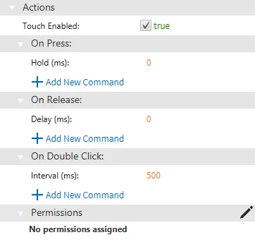
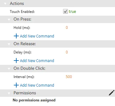
Actions
Section titled “Actions”If the momentary button is pressed, released, or double-clicked, the button runs a script or command. This is controlled under the On Press, On Release, or On Double click section of the Actions tab.
Action Button Properties
Section titled “Action Button Properties”The action button functions when it is pressed, released, or double-clicked, allowing for scripts or other commands to be called.
The action button has two states: unpressed and pressed. The button image and text, if enabled, can be customized.


Basic Properties
Section titled “Basic Properties”The Basic Properties section allows users to change the displayed content and formatting within the object. The basic properties section will appear as "Action Button."
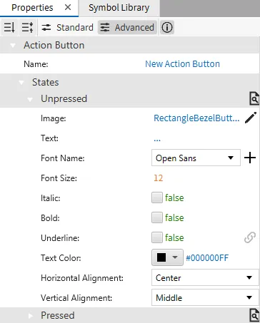
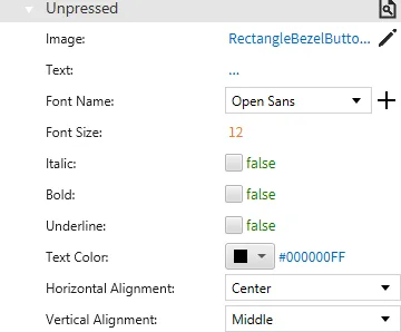
Unpressed
Section titled “Unpressed”When the action button is inactive, or unpressed, the following properties appear:
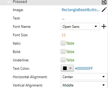
Pressed
Section titled “Pressed”When the action button is active or pressed, the following properties appear:
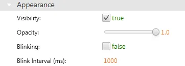
Appearance
Section titled “Appearance”The Appearance pane enables the use of selections to alter visible characteristics.
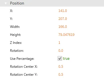
Position
Section titled “Position”The Position section provides adjustable properties that reshape or move the object.
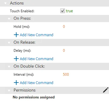
Actions
Section titled “Actions”If the action button is pressed, released, or double-clicked, the button runs a script or command. This is controlled under the On Press, On Release, or On Double click section of the Actions tab.
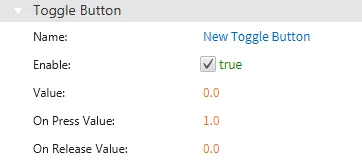
Toggle Button Properties
Section titled “Toggle Button Properties”The toggle button changes a tag's value when it is toggled on or off. The toggle button also functions when it is pressed, released, or double-clicked, allowing for scripts or other commands to be called.
The toggle button has two states: inactive and active. Depending on the button state, the image and text, if enabled, can be customized.


Basic Properties
Section titled “Basic Properties”The Basic Properties section allows users to change the displayed content and formatting within the object. The basic properties section will appear as "Toggle Button."
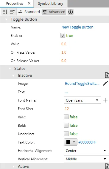
The toggle button should have a tag bound to it. When the button is pressed, the tag value is the same as the on press value entry. When the button is pressed again, the tag value is the same as the on release value entry.
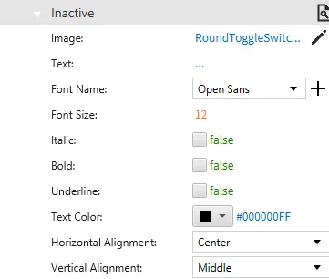
Inactive
Section titled “Inactive”The toggle button has two states: inactive and active. The inactive state can be customized under the inactive tab. When the button is released or not being pressed, the button image can be customized, and text, if enabled, can appear.
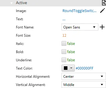
Active
Section titled “Active”The active state can be customized under the active tab. When the button is active, the below properties will render.
Appearance
Section titled “Appearance”The Appearance section enables the use of selections to alter visible characteristics.
Position
Section titled “Position”The Position section provides adjustable properties that reshape or move the object.
Actions
Section titled “Actions”If the toggle button is pressed, released, or double-clicked, the button runs a script or command. This is controlled under the On Press, On Release, or On Double click section of the Actions tab.