Gauge Introduction
Gauge Feature Description
Section titled “Gauge Feature Description”Canvas has three built-in gauge types: Round Gauge, Horizontal Gauge, and Vertical Gauge. Gauges are used to visually represent a range of values and can be customized with different settings, including value ranges, steps, and appearance.
Gauge Designer Functionality
Section titled “Gauge Designer Functionality”Click Insert > Gauges, or the Insert Gauge icon on the toolbar and select the gauge to create. Click and drag on the page to bring up the selected gauge.
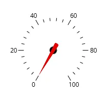
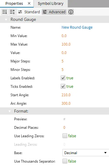
Round Gauge Properties
Section titled “Round Gauge Properties”The Round Gauge is a circular gauge used to represent values between a specified minimum and maximum. The gauge supports custom labels, ticks, and value formatting.
Basic Properties
Section titled “Basic Properties”Properties like Min Value, Max Value, and Value define the operational range of the gauge. The gauge can also be customized with major and minor step divisions, enabling more detailed value representation. Labels and ticks can be enabled or disabled based on user preferences.
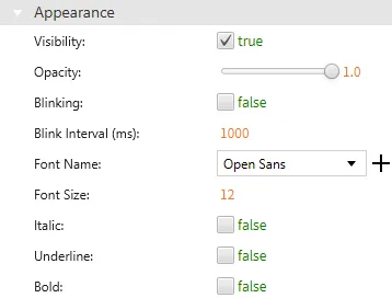
Appearance
Section titled “Appearance”The round gauge appearance settings allow control over the visibility, opacity, and angle of the arc. You can also customize the font and other text-related settings for displaying the gauge value.
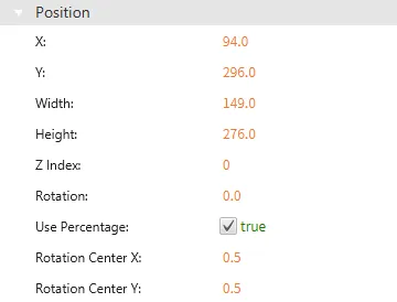
Position
Section titled “Position”The Position section provides adjustable properties that reshape or move the gauge object.
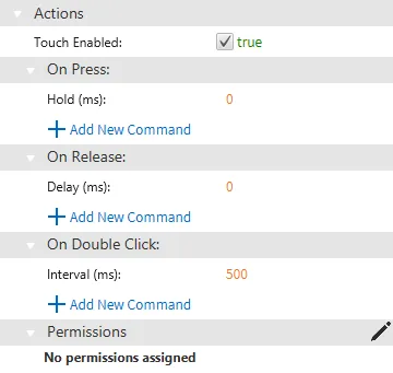
Actions
Section titled “Actions”The Actions section allows users to define behaviors when interacting with the gauge, such as On Press, On Release, or On Double Click. Users can set a custom action to trigger a script or command during these interactions.
Permissions can be assigned to the gauge object through the Identity and Access Management feature.
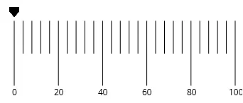
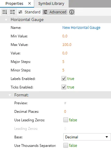
Horizontal Gauge Properties
Section titled “Horizontal Gauge Properties”The Horizontal Gauge displays values in a linear, horizontal format. Similar to the round gauge, it has properties for setting minimum and maximum values, step intervals, and enabling or disabling labels and ticks.
Basic Properties
Section titled “Basic Properties”The horizontal gauge also supports various transformations, such as changing the gauge's position, size, and rotation.
Appearance
Section titled “Appearance”The appearance section allows you to set properties like visibility, opacity, and styling for labels and ticks.
Position
Section titled “Position”The Position section provides adjustable properties that reshape or move the gauge object.
Actions
Section titled “Actions”The Actions section allows users to define behaviors when interacting with the gauge, such as On Press, On Release, or On Double Click. Users can set a custom action to trigger a script or command during these interactions.
Permissions can be assigned to the gauge object through the Identity and Access Management feature.
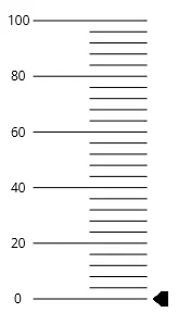
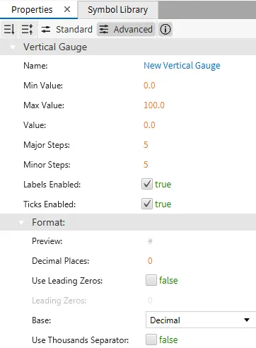
Vertical Gauge Properties
Section titled “Vertical Gauge Properties”The Vertical Gauge is a linear gauge oriented vertically, and it is used to display values within a defined range. It has similar customization options to the horizontal gauge but is displayed in a vertical format.
Basic Properties
Section titled “Basic Properties”Like the other gauges, you can adjust values such as minimum, maximum, and steps.
Appearance
Section titled “Appearance”The appearance and transformation properties allow further customization of the gauge's look and behavior.
Position
Section titled “Position”The Position section provides adjustable properties that reshape or move the gauge object.
Actions
Section titled “Actions”The Actions section allows users to define behaviors when interacting with the gauge, such as On Press, On Release, or On Double Click. Users can set a custom action to trigger a script or command during these interactions.
Permissions can be assigned to the gauge object through the Identity and Access Management feature.